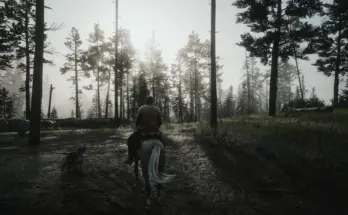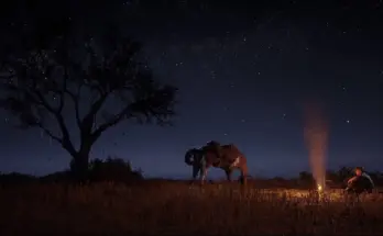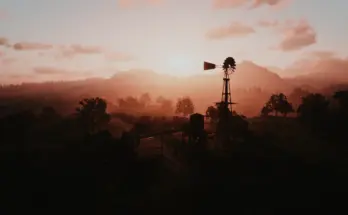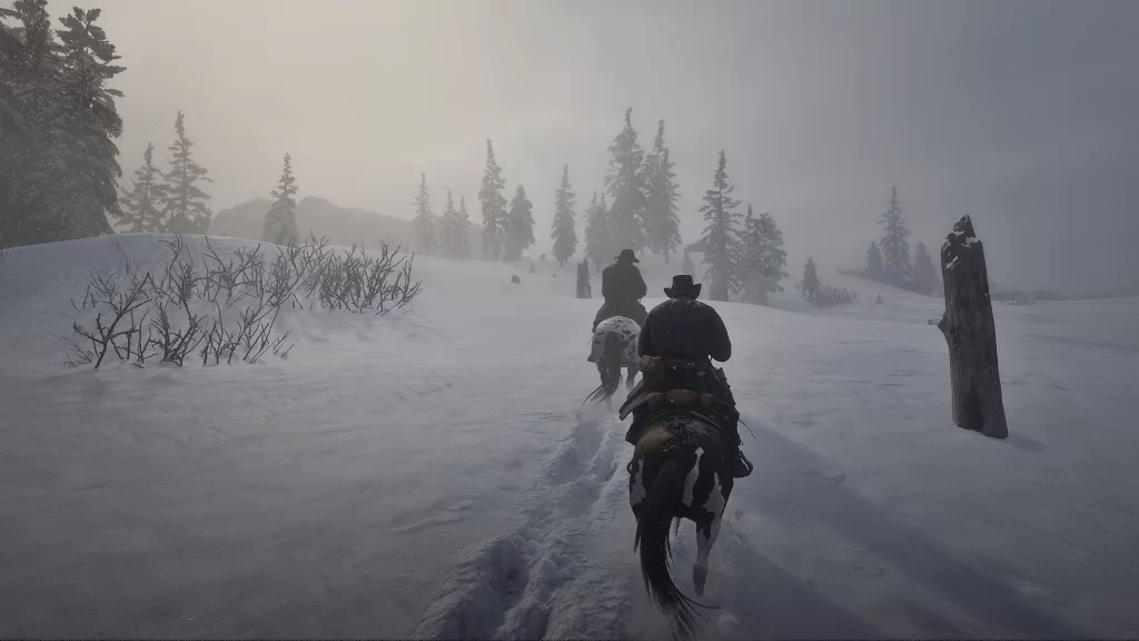
Varnish for your graphic.
Sophisticated ReShade that reconstruct image informations, improves the flow of light, colours, fog, depth perception, shadows, contrast overall – getting you a more immersive realistic image and more eyecandy while staying true to the artists original vision and colour grading.
FIRNIS is a ReShade Preset that functions as the last layer (“fear-niz” is german for “varnish” for paintings) to give a better image with more details, better textures, better bloom and fog and more realistic light emission and flow – it helps the threedimensional perception and may reduce symptomes of migraine when you react sensitive to fake, foggy and bright light inviroments in games (lets you survive the first act). It gives you an overall better, more immersive look.
It is meant to be a respectful ReShade.
Develop the Image, not alter the creators vision and colour grading, but to give the graphics a finishing touch.
It rises and handles image information the shadows, but without lifting daylight or cause clipping in other. It’s more like… de-clipping.
You will in fact get more to see, and a broader dynamic range – nights will be a bit more bright and everything more visible thanks to the moonlighgt, while in the daytime it is just clearer and gets more “pop” and details in the shadows. The sunlight also has more colour and weight, so the warm sunset shows more on snow and surroundings, gives your a more realistic perception of weather.
Works for every graphical setting and resolution, on top of any graphic mods.
It is build in mind to work as a “one tool for all”-solution, working in every situation.
It gives you better materials, metal feels more metal and it overall burst your immersion!
Skin is more realistic.
TL;DR:
– a brider dyamic range
– better contrast
– better light emmision – it fills the space and effects everything a little bit more. Less the feel of lightspheres floating in dark spaces.
– sunlight has more weight and colour
– better skin
– more details and visibility in low light situations and blacked out shadows, shows great in cutscenes of interiors
– a hint more colourful
– better (and abit more subtile) bloom and fog
– better distant fog
– menu’s transparency is a bit higher, it feels more lightweight and modern
– slightly sharper
– better readability of ui elements
– better structures and textures
– more realistic and immersive metal reflections
– overal l less cloudy, muddy feel
– eyefriendlier (i get less migraine while playing, i guess because my eyes dont try to adapt to that fake bloomy light situation)
– everything fills the same space, the room looks more 3d, perception of depth is better
– overall a more high quality, “next gen” look
– it’s more immersive
– it’s like getting glasses
FIRNIS is quite performance friendly for what it does, i guess – i just lose around 1-3 fps at a normal somewhat around 40 fps performance (on a FX-8350 with GTX 1070). I would count it as “not noticable”. Fps hunger expands when having more pixels to calculate, of course. So beware of the fact that 4k is four times the pixel count as 1080p!
The predecessor was told from users to have 1-5 fps lost. So i guess that’s it.
But as always: you must try by yourself and look if it suites you.
(Try it out!)
INSTALLATION:
1) Install the latest ReShade Installer by selecting your RDR2.exe in the main folder, make sure you choose to install all plugins.
2) Drop the .ini-files you found in my download into your RDR2 main folder .
3) Open Reshade’s menu overlay ingame with [Pos1] and select the ‘Firnis 1.51 – Image and Light Enhancing’-ini .
Make sure to be in performance mode.
Go into ReShade’s Settings Tab and asign an “Effect Toggle” key to quick turn it on and off to see the difference the reshade makes.
I usually use [Num del], as it comes handy near the mouse.
Assign a screenshot hotkey and a screenshot folder. I use [ScrollLock] and usually create a /screenshot-folder in the main folder.
You have to use reshades screenshot function – using the internal screenshot function won’t show the enhanced image!
Done! Enjoy.
a) If the game looks oversharpened, uncheck AdaptiveSharpen.fx. Lumasharpen is for improving highlights, this has to stay on.
b) When you search for a bit more or less contrast, curves.fx is what you want to alter (a little). To alter parameters you have to uncheck ‘performance mode’.
Too much will crush the shadows again tho and give terrible saturation burn. I would not recommend to set it strength between 0 and 0.3 – standard is 0.175 .
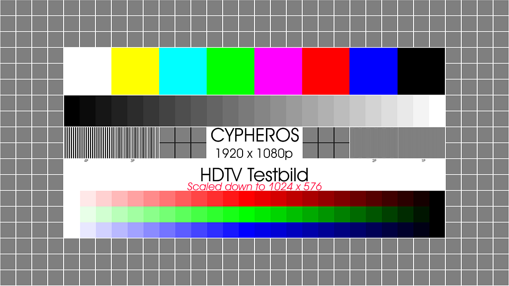
4) Also you should really consider calibrating the contrast/brightness of your monitor/tv!
Calibrating colour is a very difficult task and unneccessary imho, but calibrating contrast is quick and easy and makes a lot!
When looking at the black to white gradient, make sure you see a difference between the first and the last two fields.
Contrast and Brightness are the settings you have to alter.
If you’ve done this, your picture will be way better than before and you will see nuances in depths and heights that otherwise would be just clipped out. Colour, as i said, is much more difficulty to calibrate and unneccessary, as every colour is relativly shift and due to that harmonious, even if a little off. But you don’t make prints that have to be accurate… so just stay with the contrast :3
Credits:
ruzzlefuzz
If the download link is outdated or doesn't work, you can add your download link. (If your link is valid, we will approve it within 24 hours.)


